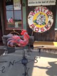
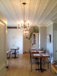
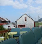
This month we spent 4 days in the Quebec village of Kamouraska. It is a plein air painter’s destination but also fulfills my needs to have gourmet food, interesting architecture, beautiful sunsets, and friendly locals. The food trail begins with the restaurants-–L’Amuse Bouche, Côte Est Cafe, Bistro de la Mer/Poissonnerie Lauzier, the bakery-La Boulangerie Niemand, the brewery- Tête d’Allumette Microbrasserie, the chocolate shop, La Fée Gourmande.
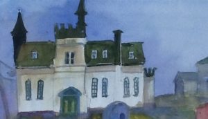
The village architecture is influenced by what settlers had in France and the need to adapt to what the lower St. Lawrence could supply. The Côte Est Cafe is located in the original Presbytery built in 1848 with a “neo-classical influence”. The former court house built in 1888 is located midway on the main street and often called the “chateau” but in the tourist information they are more specific saying ” second empire, la renaissance française”. As all French Canadian villages the church is the heart. The recent building was constructed in 1912, after four previous churches perished, by the architect Joseph-Pierre Ouellet with a “neo-renaissance influence”. For an interesting insight into this village the booklet Carnets de Kamouraska ( french only) is an informative source.The text is by Paul Louis Martin and illustrations by resident artist Anne Michaud in watercolour and ink.
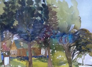
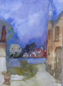
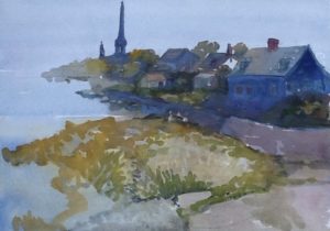
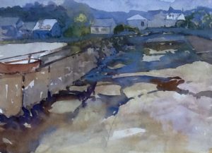
My contribution on how I see the village is through my sketches in watercolour & gouache on Arches and Fabriano paper. My interest in gouache started with my Chinese painting workshop last month. At the time of buying my supplies I was told gouache would be a good substitue for the required Chinese paint. Liam Quan Zhen our instructor, quickly, told me this is the sequence, watercolour, chinese paint, gouache. So I put aside my gouache and bought the required paint brand, Yasutomo. Liam pointed out the need to read the label on artist quality paint. A common colour name is not enough if you want exact results. For example, when he called for vermillion the number on the tube is #51 or phthalo blue #57 or light green #55. He pointed out the need for pigment colour index names and numbers Often paint colours that have the same name or slightly different name can vary greatly once on the page. If you wish to have similar results to your instructor pay attention to the brand name and paint type.

